An interactive guide to Disney's 12 Principles of Animation.
Overshoot.dev
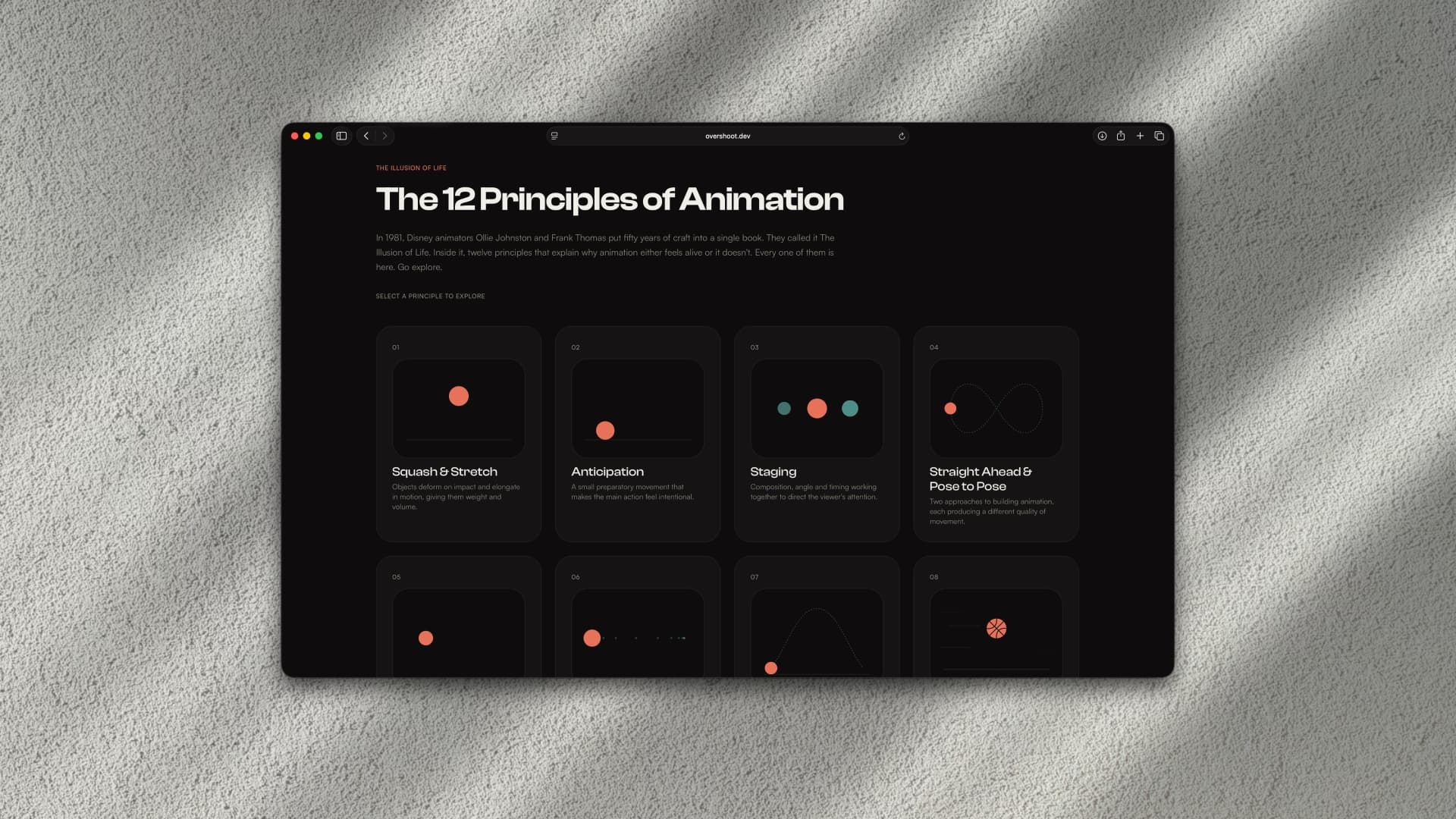
The Idea
Disney animators Frank Thomas and Ollie Johnston published The Illusion of Life in 1981. Inside it, twelve principles that explain why some animation feels alive and some doesn't. They're widely referenced but rarely demonstrated in a way you can actually feel.
Most resources explain the principles with diagrams or static examples. I wanted to build something where the principles were the interface. Where you could adjust a slider and immediately understand why timing changes the weight of a movement, or why removing arcs makes something read as mechanical.
Overshoot.dev is that. Twelve interactive animations, one per principle, built to be played with.
How It Works
- Twelve individual SVG animations, each designed to demonstrate one principle in isolation.
- A card grid on desktop and a Swiper carousel on mobile, each expanding into a full detail view per principle.
- The aesthetic sits between two polar references. Disney's warmth meets Material Design's precision. Sans serif typefaces with a retro character. Off-white and off-black for a vintage feel. Coral and teal pulled from two-strip Technicolor processing. Old craft, modern precision.
- Used GSAP throughout for both the UI transitions and all principle animations, keeping the motion system consistent and the site itself animated.
- Shipped as a SvelteKit SPA at overshoot.dev in a single weekend.
What I Learned
Speccing the animations required understanding each principle well enough to isolate the single variable that makes it legible.
Squash and stretch only reads correctly if volume stays consistent. Anticipation only works if the timing of the setup is right. Every principle had one key thing that made it feel true, and finding that thing was the real design work.
The development was almost secondary once the animations were right. The harder challenge was making twelve completely different interactive examples feel like they belonged to one cohesive system.
GSAP across both the content and the UI was the right call for that.

